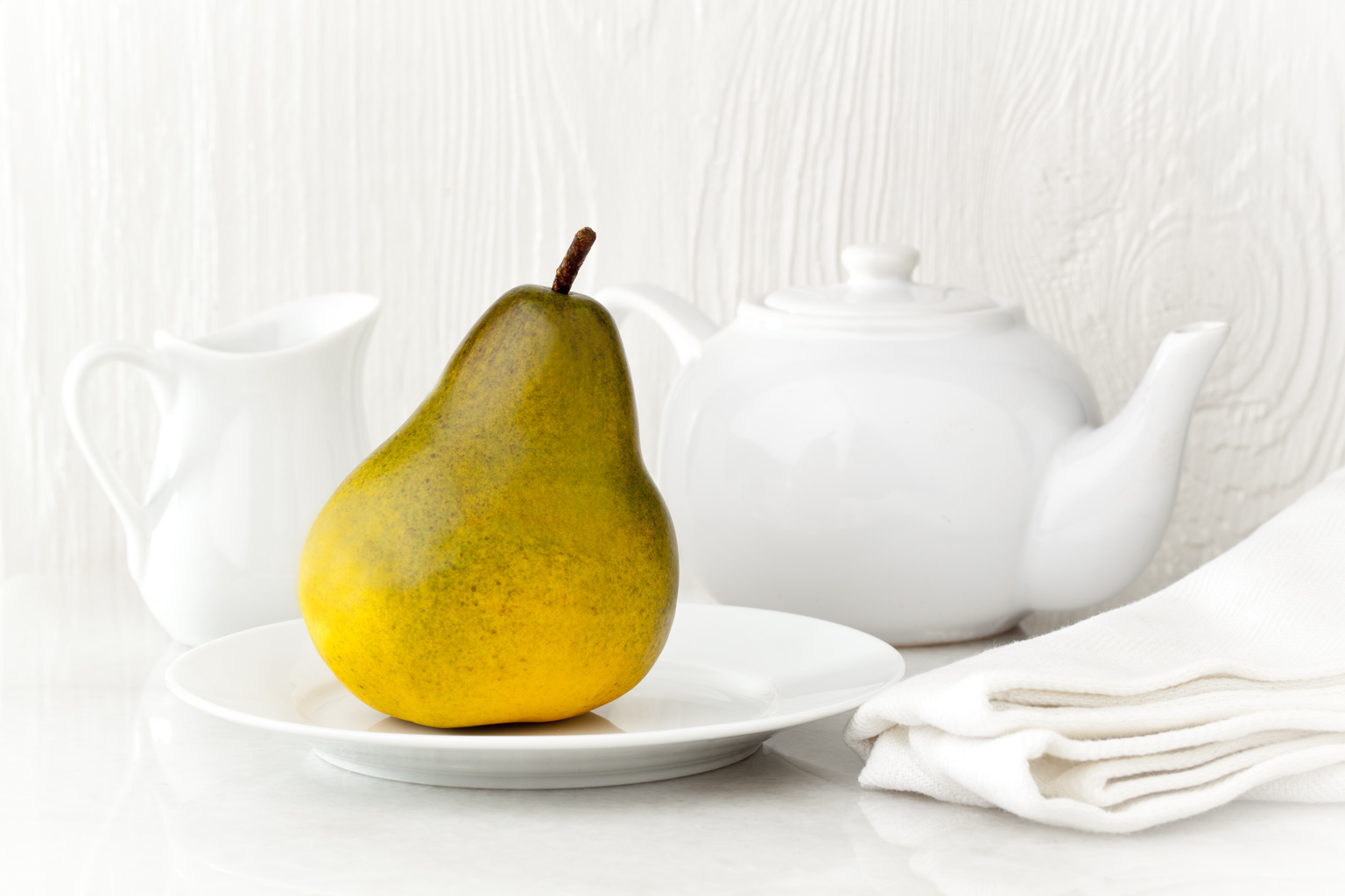
The texture seems OK, but in this shot the upper left is a bit bleached out. Also, I don’t like a white background when there is so much white in the picture. The monochromatic background does accentuate the pear really well, and the pear looks great; I just think it might be better without the cup and tea kettle, or if they or the wall were gray rather than white.
I like the high key/monochrome composition. On my monitor, detail is maintained throughout the image. Spherical, reflective surfaces are not easy and you did a nice job here. When I look at my images on other computers I often cringe. It’s amazing how much variability there is in the monitors of the world and even though I keep my monitor calibrated that doesn’t help when others look at the images : (
Your point was about the wood. I think it looks great!
Thanks guys. On my monitor, it is brighter in the upper left but there is plenty of detail. On the other hand, looking on another monitor, it does look too bright in the upper left. The true test would be how it looks in print…maybe someday.

The texture seems OK, but in this shot the upper left is a bit bleached out. Also, I don’t like a white background when there is so much white in the picture. The monochromatic background does accentuate the pear really well, and the pear looks great; I just think it might be better without the cup and tea kettle, or if they or the wall were gray rather than white.
I like the high key/monochrome composition. On my monitor, detail is maintained throughout the image. Spherical, reflective surfaces are not easy and you did a nice job here. When I look at my images on other computers I often cringe. It’s amazing how much variability there is in the monitors of the world and even though I keep my monitor calibrated that doesn’t help when others look at the images : (
Your point was about the wood. I think it looks great!
Bob Lewis
Thanks guys. On my monitor, it is brighter in the upper left but there is plenty of detail. On the other hand, looking on another monitor, it does look too bright in the upper left. The true test would be how it looks in print…maybe someday.
Jerry